

Jobs’s work with legendary designer Paul Rand taught him lessons that any designer, client, or entrepreneur should take to heart.
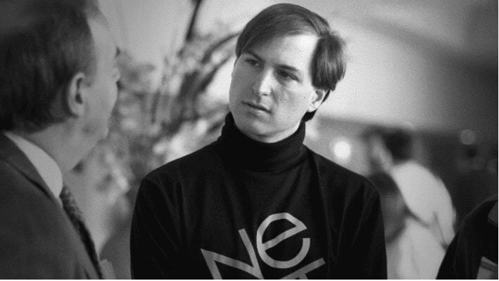
The year is 1986. Steve Jobs meets Paul Rand, the genius responsible for branding IBM, UPS, and Westinghouse. Having just been ousted from Apple, Steve asks Rand to create a logo for his new company, Next Inc. Rand accepts the job. Over the following months–and years–Jobs would learn from Rand, who came of age in a very different era of company-building. Those lessons would include how to brand a startup, but also what a logo can–and can not–do for a company. In this 1993 interview, Jobs talks about the experience.
Jobs recounts that he didn’t know much about Rand himself but was struck by his work, especially his “extremely powerful and emotional” Eye-Bee-M logo. But after reading a few books about his creation, he decided not to approach any other designer about the possibility of branding the new company–he only wanted Rand.
He knew that the legendary modernist designer didn’t work for startups, only with well-established corporations, like IBM or Ford. Jobs knew it wasn’t a matter of money; he could easily afford Rand’s $100,000 price tag, almost a quarter million in 2017’s dollars. It was about Rand’s first principle of design: “A logo derives meaning from the quality of the thing it symbolizes, not the other way around.” In other words, Rand believed that a logo could only be as good as the company it represents. It’s like a band’s name–if the Rolling Stones had sucked, we would all be laughing at their stupid moniker. But since they rocked, the name and iconic tongue symbol are remembered as awesome.

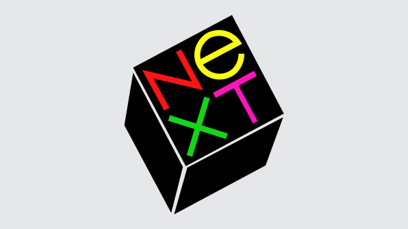
Nevertheless, Rand accepted, perhaps due to Steve’s so-called Reality Distortion Field–his infamous talent for convincing you of anything he wanted. “He said he’d love to do it,” as Jobs explains in the interview. After accepting, Rand made many visits to Next’s offices, full of ex-Apple employees who followed their beloved captain (they actually called themselves a band of pirates back then) from Apple’s Macintosh division to this new adventure.Jobs says that Rand soon understood their predicament. Next didn’t want just a logotype, like any other company. It wanted a symbol, too, a “sort of a jewel” as he calls it–what designers call a logomark. Steve got what he wanted and, in the process, learned a few crucial lessons about branding that would influence his later work.
AVOIDING THE “A DECADE AND $100 MILLION” PROBLEM
The problem with logomarks is…