As of April 2019, Facebook’s potential advertising reach globally is 1.887 billion people. That represents 32% of everyone over the age of 13.
Statistics also show that people continue to interact with Facebook ads. The average Facebook user clicks on 11 ads in 30 days.
But there’s a lot of competition out there, so only the best Facebook ad examples will get one of those coveted 11 clicks. With more than a quarter of all Facebook Pages using paid ads, you’ve got to know how to stand out from the crowd.
Here, we focus on highlighting some of the best Facebook advertising examples so you can model the success of these winning campaigns.
Bonus: Download a free guide that teaches you how to turn Facebook traffic into sales in four simple steps using Hootsuite.
16 winning Facebook ad examples to learn from
Facebook image ad examples
1. LEGO

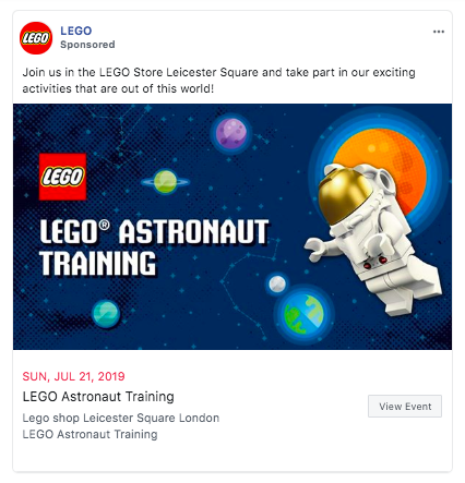
What’s great about this ad
- With this bright, colorful visual creative, LEGO proves that image ads don’t need a photo to be effective.
- Creative copy creates intrigue without giving too much away, encouraging clicks.
- The call-to-action button uses low-commitment text (“View Event”) to encourage clicks
- The ad points to a Facebook Event, so it does triple-duty: (1) Those interested in the event itself can RSVP. (2) Those RSVPs create additional organic exposure on friends’ feeds. (3) Since LEGO’s Facebook Page is linked as the host of the event, the event page can also bring in new Facebook followers.
2. Snag Tights

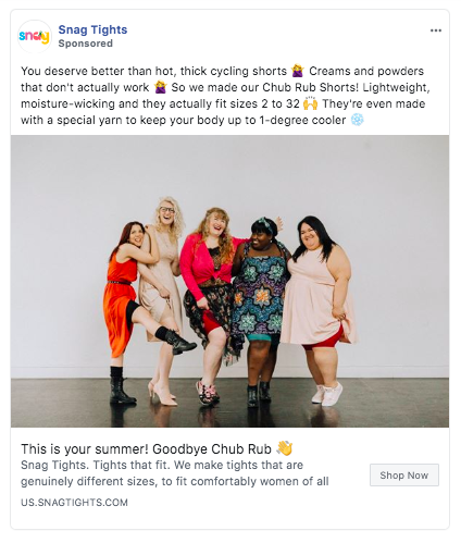
What’s great about this ad
- The copy speaks directly to the target audience’s concerns and highlights the Snag Tights brand promise.
- The photos shows the product in use by a wide range of body types, enforcing the copy’s claims.
- The image is colorful and appealing, and could even look like a friend’s photo at first glance, drawing the viewer in long enough to read the copy.
Facebook video ad examples
3. Tattoodo
What’s great about these ads
- These two videos both started as posts on Tattoodo’s Facebook page. Once it became clear they were achieving high engagement, they were promoted as ads. Boosting high-performing content is a great way to extend the reach of content that has already been proven effective.
- The ads show how Tattoodo uses different video lengths and styles for different campaigns. The first video is nearly two minutes long, while the second is just 25 seconds. There’s no one video format that works for every goal, so it’s a great idea to test and experiment.
- The videos are colorful and eye-catching and move quickly.
- Each video ends with a clear call to action.
4. Nuud
What’s great about this ad
- The video and copy address some of Nuud customers’ main questions about the product: is the packaging environmentally friendly, is the product really all-natural, and will the product work on men.
- The square video format works well for both mobile and desktop News Feeds.
- The video is optimized for viewing without sound.


